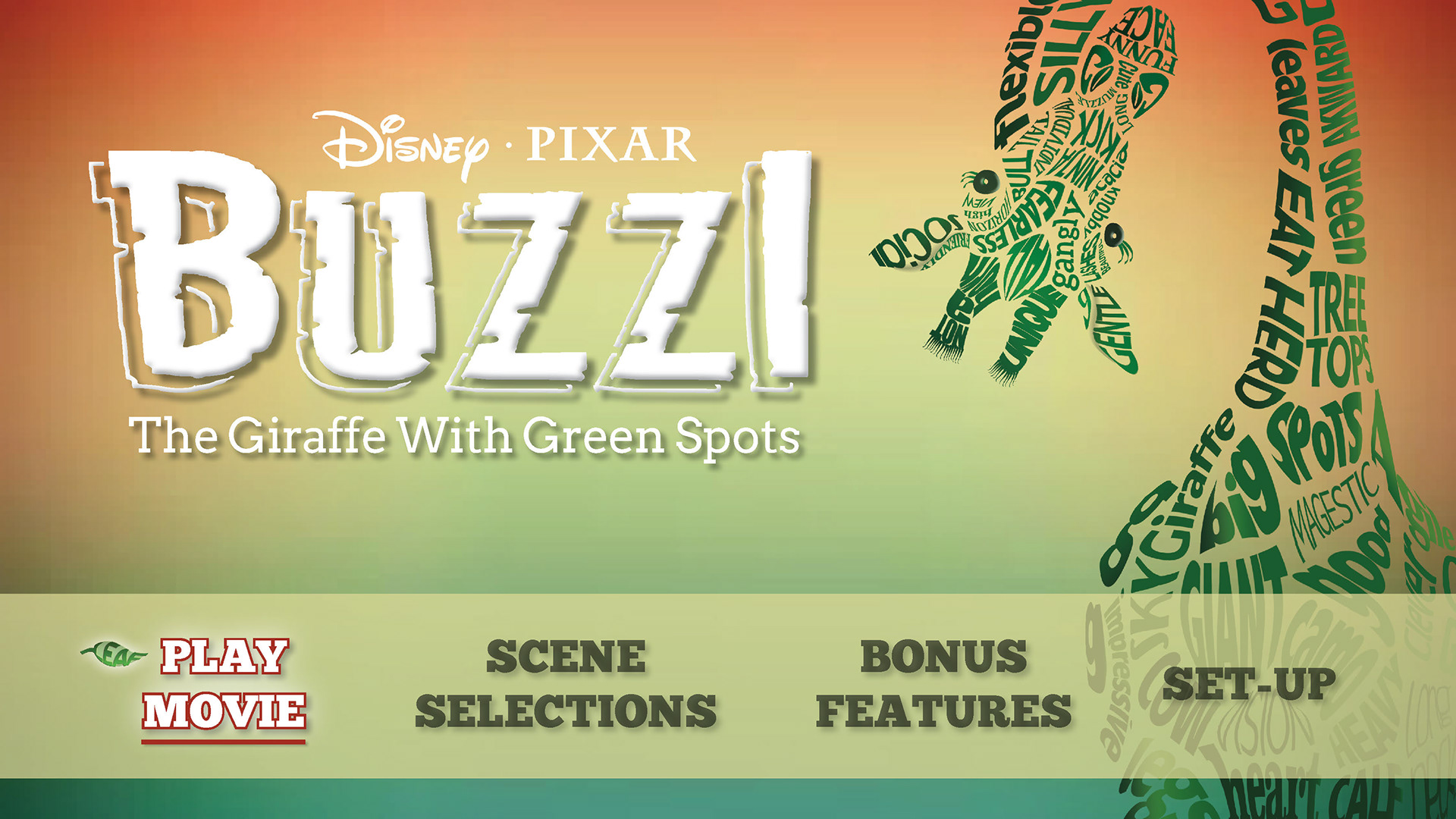
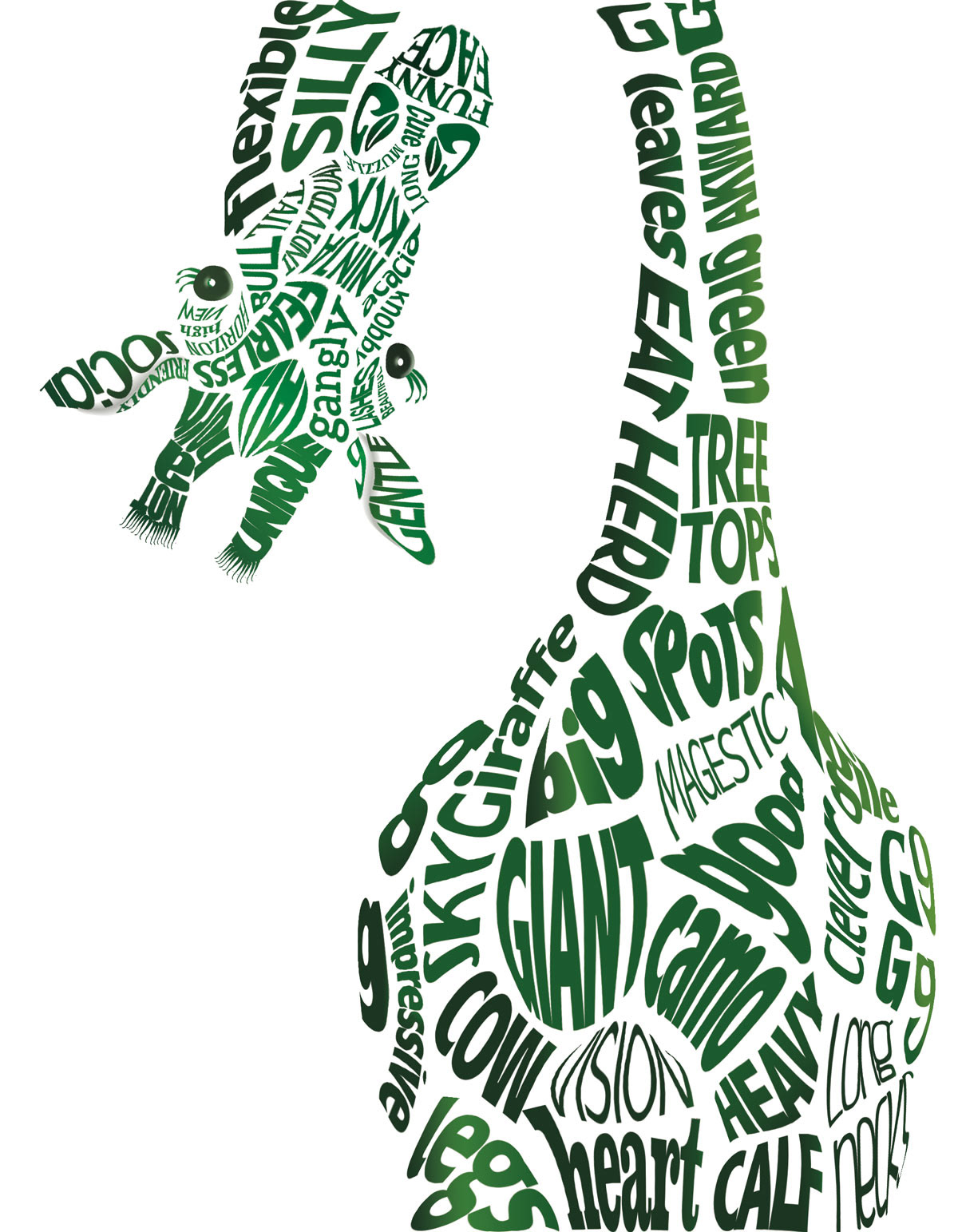
Buzzi, the Giraffe with Green Spots
Coursework: AiPOD, Advanced Typography Year: 2015 Concept: DVD Cover

This is a concept only and is not intended to be representative of a real and/or existing entity.
The purpose of this project was to create a DVD cover and start menu for a fictional movie of our choice that explores the use of typography as an exclusive element of design. My design concept was inspired by a short story my oldest daughter wrote. The first thing that I wanted to achieve when considering design ideas for my DVD cover was to emulate the look and feel of what we all recognize as the typical Disney “look” - something that would make a connection with my target audience through a rich imagination and a strong sense of appeal.
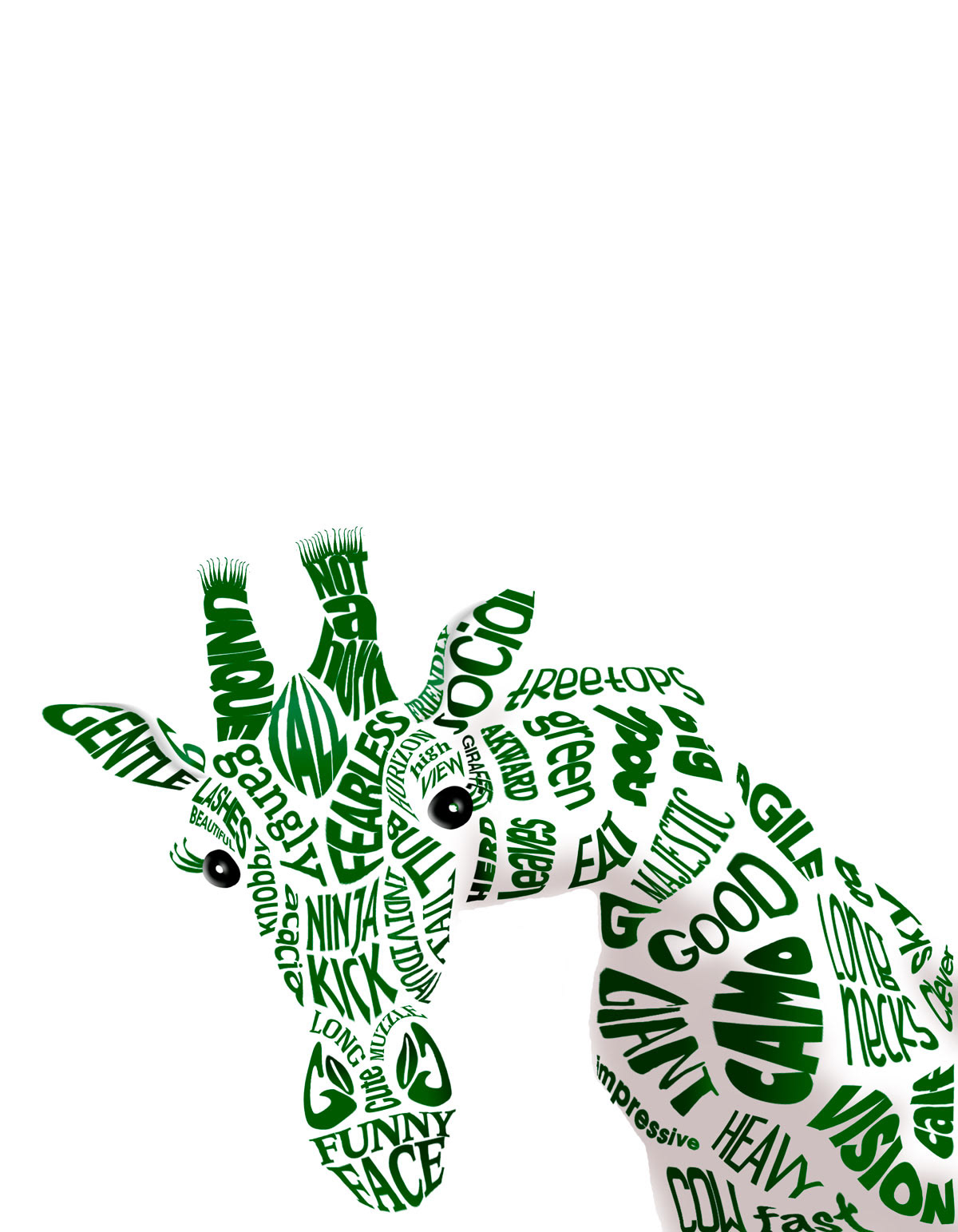
The colors needed to be bright and eye-catching, but still capture the mood of the story line. With this in mind, I used a color scheme that conveyed the sense of growth. The typeface I chose for the main title is called Jungle Roar. The subtitle typeface of Twentytwelve Slab is a slab serif font style, which complements the decorative display font style of the main title. The asymmetrical layout works well with the type-as-image Buzzi character “peeking” into the frame. With his pose, I wanted to capture a sense of his playfulness and curiosity, a side of him that he is otherwise likely to hide.
Typographic Elements for the DVD Cover and Start Menu Screen
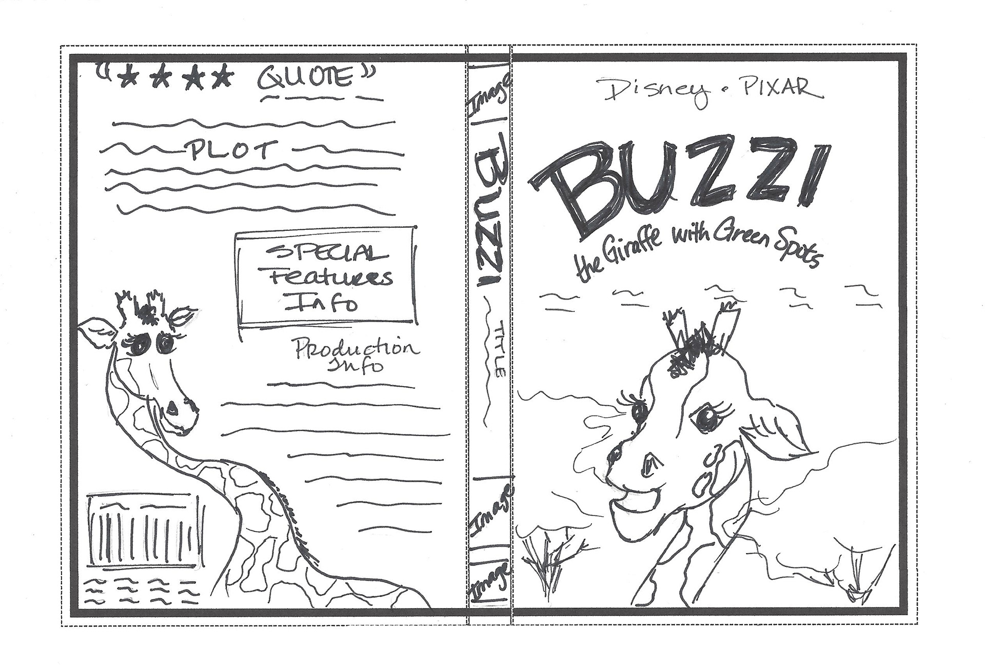
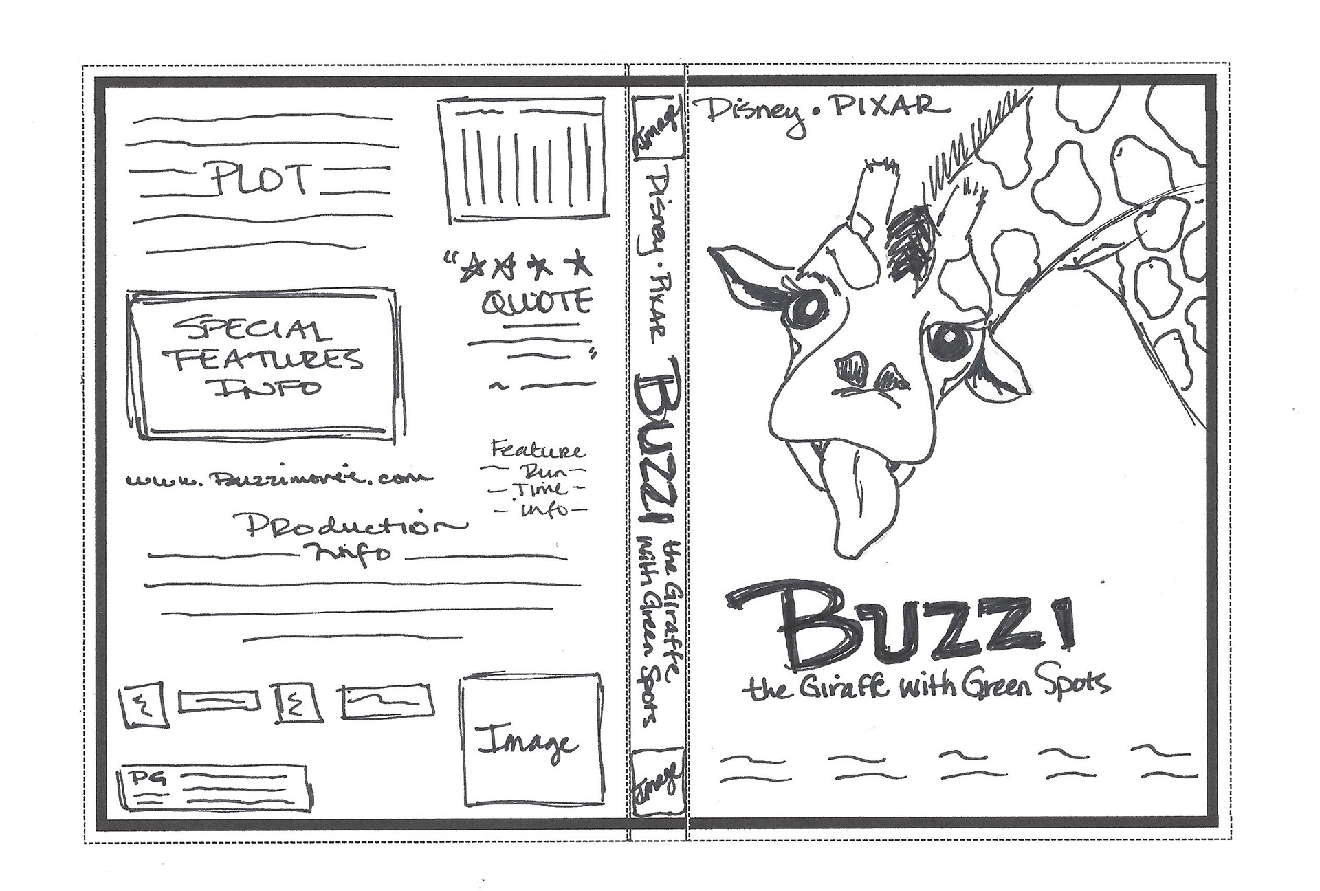
Initial Thumbnails Sketches for the DVD Cover